Originally posted on June 21, 2017 - price and availability of particular products mentioned in this post may have changed.
Three Design Principles for Creating a Space Without Relying on Color
If you've read our Designing with Dark Neutrals post or seen our Dark Neutral Design video, you know just how easy it is to create a room with a neutral color palette. Here, we created a room with light neutrals to demonstrate three more basic design principles that you can use to create a home that tells your unique story without relying on color.

Repetition
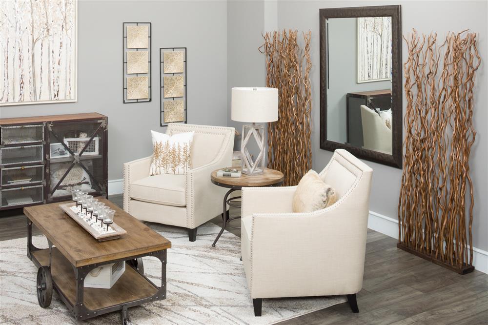
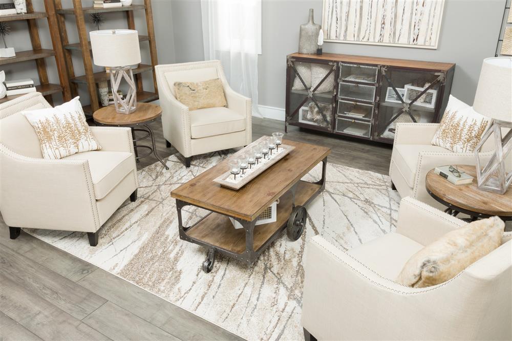
One of the key design principles we used when putting this space together is repetition. We repeated touches of glam throughout the room with the chrome nail head on the linen-look chairs, the subtle shimmer of the lampshade on the lamp, and the mirrored leaves on the canvas.

Contrast
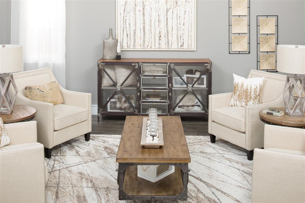
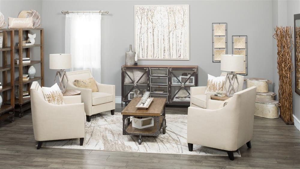
Even though we wanted to create a room with a glamorous feel, we still wanted the room to have a relaxed vibe. We positioned a vintage-rustic console in the center of the room to contrast the touches of glam and act as a focal point. We then incorporated a vintage-rustic coffee table, end table, and bookcases to create a cohesive look.

Balance
The last design principle we used to pull the whole room together is balance, which creates a feeling of unity and sophistication in a space while also being inviting and easy on the eye. In our space we created a sense of balance by placing a pair of linen-look chairs on either side of our focal point.
By repeating elements throughout the room, creating contrast, and balancing furniture within a space, you can easily create a space that proves that you don't need color to tell your story.


